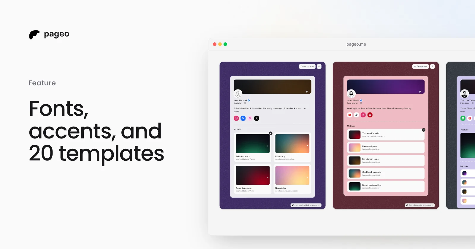
A link in bio page should feel like yours, not like everyone else's. pageo now lets you change the font, the accent color, and the way your links look, from the same Layout panel you already use for colors. All of it is free.
Six font pairs
Open Layout in the editor toolbar, then Style. Each pair sets a heading font for your name, section titles, and link titles, and a body font for everything else.
| Pair | Feels like |
|---|---|
| Inter | The original pageo look. Clean and neutral |
| Geist | Sharp and modern, good for developers and studios |
| DM Serif | A serif heading over DM Sans. Editorial and warm |
| Grotesk | Space Grotesk. Bold and a little playful |
| Fraunces | A soft serif heading over Inter. Good for writers |
| Mono | JetBrains Mono headings over Inter. Made for code people |
A font loads only on pages that use it, so your page stays fast.
An accent color
Pick one of nine accent colors, or keep the default. The accent colors your Subscribe button, the edges of your link cards, your pinned link, and the links in your bio. Every accent is dark enough that white text on it stays easy to read.
Three link styles
The link style works in every layout, grid, list, and minimal:
- Soft is the original look: light cards that lift on hover.
- Outline draws each link in your accent color.
- Filled fills each link with your accent, with white text.
A moving background (Pro)
pageo Pro adds a slow moving layer behind your page: Drift, Glow, or Grain. It moves without repainting the page, and it stops for visitors who ask their device for less motion.
Start from a template
If you would rather not choose, start from a template. There are now 20, grouped into work and portfolios, creators, business, and music and events. Each sets a layout, colors, and often a font, an accent, and a link style. Pick one on the templates page and your new page starts with it.
You can change every part of the look later in the Layout panel. Your name, photo, bio, and links always stay your own.